


crosbysvarietyshop
Stainless Steel Flat Top Griddle with Handles
Stainless Steel Flat Top Griddle with Handles
Couldn't load pickup availability
SPECIFICATIONS
Function: Flat Top Griddle
Material: Stainless Steel
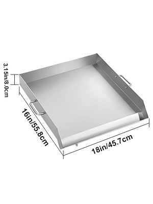
Item Dimension: 36" x 22"; 32" x 17"; 18" x 16"
Suitable For: Outdoor BBQ
Use: Over Electric Griddles, Gas Stoves, and Charcoals

margin: 0;
padding: 0;
box-sizing: border-box;
}
.clearfix:before,
.clearfix:after {
content: "";
display: table;
}
.clearfix:after {
clear: both;
}
@font-face {
font-family: "iconfont";
src: url('iconfont.eot?t=1545182990006');
src: url('iconfont.eot?t=1545182990006#iefix') format('embedded-opentype'), /* IE6-IE8 */ url('data:application/x-font-woff;charset=utf-8;base64,d09GRgABAAAAAAQoAAsAAAAABmwAAQAAAAAAAAAAAAAAAAAAAAAAAAAAAABHU1VCAAABCAAAADMAAABCsP6z7U9TLzIAAAE8AAAARAAAAFY850hjY21hcAAAAYAAAABLAAABcOeZtv1nbHlmAAABzAAAAHgAAAB4lY+zvmhlYWQAAAJEAAAALgAAADYTnsQMaGhlYQAAAnQAAAAcAAAAJAfeA4NobXR4AAACkAAAAAgAAAAICAAAAGxvY2EAAAKYAAAABgAAAAYAPAAAbWF4cAAAAqAAAAAeAAAAIAEOAC5uYW1lAAACwAAAAUUAAAJtPlT+fXBvc3QAAAQIAAAAHwAAADDX3mJ6eJxjYGRgYOBikGPQYWB0cfMJYeBgYGGAAJAMY05meiJQDMoDyrGAaQ4gZoOIAgCKIwNPAHicY2BkYWCcwMDKwMHUyXSGgYGhH0IzvmYwYuRgYGBiYGVmwAoC0lxTGByeFT4rZG7438AQw9zA0AAUZgTJAQDuzQzFeJxjYGBgZWBgYAZiHSBmYWBgDGFgZAABP6AoI1icmYELLM7CoARWwwISf1b4/z+MBPJZwCQDIxvDKOABkzJQHjisIJiBEQA9SwstAAACAAD/iAPtA20AFQAhAAAFAT4BNS4BJw4BBx4BFzI2NwEWMjY0JS4BJz4BNx4BFw4BA9/+/yovBOaureYEBOatSYE1AQEOJBv9s4azAwOzhoezAwOzKgEBNYFIreYFBeatreYELyr+/w0bJNAEs4aHswMDs4eGs3icY2BkYGAAYiFDQb14fpuvDNwsDCBww/4AL4L+38HCwJwL5HIwMIFEAdWrCAAAAHicY2BkYGBu+N/AEMPCAAJAkpEBFTABAEcIAmsEAAAABAAAAAAAAAAAPAAAeJxjYGRgYGBiUAJiBjCLgYELCBkY/oP5DAAMAAE9AAB4nGWPTU7DMBCFX/oHpBKqqGCH5AViASj9EatuWFRq911036ZOmyqJI8et1ANwHo7ACTgC3IA78EgnmzaWx9+8eWNPANzgBx6O3y33kT1cMjtyDRe4F65TfxBukF+Em2jjVbhF/U3YxzOmwm10YXmD17hi9oR3YQ8dfAjXcI1P4Tr1L+EG+Vu4iTv8CrfQ8erCPuZeV7iNRy/2x1YvnF6p5UHFockikzm/gple75KFrdLqnGtbxCZTg6BfSVOdaVvdU+zXQ+ciFVmTqgmrOkmMyq3Z6tAFG+fyUa8XiR6EJuVYY/62xgKOcQWFJQ6MMUIYZIjK6Og7VWb0r7FDwl57Vj3N53RbFNT/c4UBAvTPXFO6stJ5Ok+BPV8bUnV0K27LnpQ0kV7NSRKyQl7WtlRC6gE2ZVeOEXpc0Yk/KGdI/wAJWm7IAAAAeJxjYGKAAC4G7ICJkYmRmYGtODWxKDmDgQEAEFwCkgA=') format('woff'), url('iconfont.ttf?t=1545182990006') format('truetype'), /* chrome, firefox, opera, Safari, Android, iOS 4.2+*/ url('iconfont.svg?t=1545182990006#iconfont') format('svg');
/* IE9*/
/* iOS 4.1- */
}
.iconfont {
font-family: "iconfont" !important;
font-size: 16px;
font-style: normal;
-webkit-font-smoothing: antialiased;
-moz-osx-font-smoothing: grayscale;
}
.icon-search:before {
content: "\e671";
}
#mobile {
width: 375px;
/* max-width: 750px;
min-width: 320px;*/
margin: 0 auto;
display: none;
}
#mobile .header {
width: 100%;
}
#mobile .header h1 {
height: 40px;
line-height: 40px;
font-size: 20px;
padding-left: 10px;
}
#mobile .header p {
height: 25px;
line-height: 25px;
padding-left: 10px;
font-size: 13px;
}
#mobile .header .searchBox {
width: 90%;
height: 25px;
padding-left: 24px;
margin: 0 auto;
border: 1px solid #949494;
border-radius: 5px;
position: relative;
}
#mobile .header .searchBox i {
width: 25px;
height: 25px;
position: absolute;
left: 0;
top: 0;
text-align: center;
line-height: 25px;
font-size: 10px;
}
#mobile .header .searchBox input {
width: 100%;
height: 100%;
float: left;
border: none;
outline: none;
}
#mobile .items {
width: 100%;
}
#mobile .items h1 {
height: 40px;
line-height: 40px;
font-size: 16px;
padding-left: 17px;
margin-top: 10px;
}
#mobile .items > p {
height: 20px;
line-height: 20px;
font-size: 16px;
font-weight: bold;
padding-left: 17.5px;
margin-bottom: 15px;
}
#mobile .items .bgimg {
width: 90%;
margin: 0 auto;
}
#mobile .items .bgimg img {
width: 100%;
}
#mobile .items .bgimg ul {
margin-top: 15px;
border: 1px solid #ccc;
padding-left: 10px;
background-color: #F3F3F3;
border-radius: 5px;
}
#mobile .items .bgimg ul li {
list-style: none;
font-size: 13px;
padding-left: 1.5em;
position: relative;
}
#mobile .items .bgimg ul li::before {
position: absolute;
left: 0;
top: 4px;
width: 8px;
height: 8px;
content: "";
border-radius: 50%;
background: #949494;
}
/*#mobile .items .bgimg ul li:first-child {
font-weight: bold;
}*/
#mobile .items .feature {
width: 90%;
margin: 0 auto;
margin-top:20px;
}
#mobile .items .feature h1 {
font-size: 14px;
height: 40px;
line-height: 40px;
padding-left: 0;
}
#mobile .items .feature ul {
width: 100%;
}
#mobile .article .pro_desc{
font-size:16px;
font-weight:bold;
line-height:36px;
}
#mobile .items .feature ul li {
width: 100%;
list-style: none;
margin-bottom: 0.75rem;
margin-bottom:30px;
}
#mobile .items .feature ul li p:nth-child(1){
text-align: center;
}
#mobile .items .feature ul li .imgBox {
width: 100%;
padding: 0 25px;
}
#mobile .items .feature ul li .imgBox img {
width: 100%;
}
#mobile .items .feature ul li p {
font-size: 16px;
/* font-weight: bold;*/
padding-left: 0;
}
#mobile .items .feature ul li .info {
padding: 0 24px;
font-size: 13px;
position: relative;
}
#mobile .items .feature ul li .info::before {
position: absolute;
left: 0px;
top: 5px;
width: 8px;
height: 8px;
content: "";
border-radius: 50%;
background: #949494;
}
#mobile .specifications {
width: 90%;
margin: 0 auto;
}
#mobile .specifications h1 {
font-size: 16px;
}
#mobile .specifications .imgBox1 {
width: 100%;
}
#mobile .specifications .imgBox1 img {
width: 100%;
}
#mobile .specifications .imgBox1 p {
font-size: 13px;
color: #575757;
text-align: center;
}
#mobile .specifications .cares {
font-size: 16px;
color: #555555;
text-align: center;
margin:20px 0;
}
#mobile .specifications .imgBox1 .info {
font-size: 13px;
color: #555555;
margin: 10px 0;
}
#mobile .specifications .imgBox1 ul {
width: 100%;
padding: 18px;
/*border: 1px solid #ccc;
border-radius: 5px;*/
}
#mobile .specifications .imgBox1 ul li {
font-size: 14px;
color: #000;
}
#mobile .specifications .imgBox2 {
width: 100%;
}
#mobile .specifications .imgBox2 img {
width: 100%;
}
#mobile .specifications .imgBox2 .details i {
font-size: 13px;
color: #555555;
}
#mobile .specifications .friendly {
margin:5px 0px;
}
#mobile .specifications .friendly ul {
border: 1px solid #ccc;
border-radius: 5px;
padding: 8px;
background: #F3F3F3;
}
#mobile .specifications .friendly ul li {
margin-left: 20px;
font-size: 14px;
}
#mobile .specifications .imgBox2 .details ul {
width: 100%;
padding: 10px 0;
}
#mobile .specifications .imgBox2 .details ul li {
font-size: 13px;
color: #000;
list-style: none;
line-height: 25px;
}
#mobile .features {
width: 90%;
margin: 20px auto;
}
#mobile .features p {
font-size: 16px;
font-weight: bold;
}
#mobile .features ul li {
margin-left: 17.5px;
font-size: 13px;
text-indent: 6.5px;
}
#mobile .product {
width: 90%;
margin: 0 auto;
}
#mobile .product p {
font-size: 16px;
font-weight: bold;
}
#mobile .product .parameter1 {
padding-left: 16px;
}
#mobile .product .parameter1 tr td {
font-size: 13px;
padding: 10px 0;
text-align: center;
}
#mobile .product .parameter1 tr td:first-child {
width: 35%;
}
#mobile .footer {
overflow: auto;
}
#mobile .footer .parameter2 {
/* border-top: 1px solid #ccc;
border-left: 1px solid #ccc;*/
width: 730.7px;
}
#mobile .footer .parameter2 tbody td {
border-bottom: 1px solid #ccc;
/* border-right: 1px solid #ccc;*/
font-size: 13px;
text-align: center;
width: 120px;
word-wrap: break-word;
word-break: break-all;
padding: 5px;
}
#mobile .product1{
width: 90%;
margin: 10px auto;
padding: 5px;
/*border: 1px solid #ccc;
border-radius: 5px;*/
}
#mobile .product1 .introduction{
font-size:16px;
font-weight:bold;
line-height:40px;
}
#mobile .footer .parameter2 td:first-child {
width:110px;
color: #646464;
}
#mobile .footer .parameter2 thead img {
width: 100%;
height: 300px;
}
#mobile .footer .parameter2 thead p {
line-height: 25px;
font-size: 16px;
color: #0066BF;
text-align: center;
}
#mobile .footernav {
width: 100%;
padding-top: 30px;
}
#mobile .footernav .about,
#mobile .footernav .payment,
#mobile .footernav .shipping,
#mobile .footernav .returns,
#mobile .footernav .contact,
#mobile .footernav .faq {
width: 100%;
padding: 0 26px;
margin-bottom: 30px;
}
#mobile .footernav .about h1,
#mobile .footernav .payment h1,
#mobile .footernav .shipping h1,
#mobile .footernav .returns h1,
#mobile .footernav .contact h1,
#mobile .footernav .faq h1 {
font-size: 16px;
line-height: 30px;
}
#mobile .footernav .about .info {
font-size: 13px;
line-height: 20px;
padding-left: 10px;
}
#mobile .footernav .payment ul li {
list-style: outside;
font-size: 13px;
line-height: 20px;
margin-left: 20px;
margin-bottom: 10px;
}
#mobile .footernav .payment ul li .pa {
font-weight: bold;
font-style: oblique;
font-size: 16px;
}
#mobile .footernav .payment ul li .pay {
color: #144774;
}
#mobile .footernav .payment ul li .pal {
color: #009ddb;
}
#mobile .footernav .shipping .imgBox {
width: 100%;
padding: 20px;
}
#mobile .footernav .shipping .imgBox img {
width: 100%;
}
#mobile .footernav .shipping .infoBox {
width: 100%;
padding-left: 26px;
}
#mobile .footernav .shipping .infoBox > p {
line-height: 40px;
font-size: 13px;
font-weight: bold;
}
#mobile .footernav .shipping .infoBox .time {
width: 100%;
margin-bottom: 15px;
}
#mobile .footernav .shipping .infoBox .time span:first-child {
font-size: 16px;
color: red;
}
#mobile .footernav .shipping .infoBox .time span:last-child {
font-size: 13px;
margin-left: 5px;
}
#mobile .footernav .shipping .infoBox .warehouse P {
line-height: 30px;
}
#mobile .footernav .shipping .infoBox .warehouse div {
float: left;
width: 100%;
height: 45px;
font-size: 13px;
color: #757575;
border: 1px solid rgb(124, 120, 120);
border-radius: 5px;
margin-left: 10px;
margin-top: 10px;
padding: 5px;
}
#mobile .footernav .shipping .infoBox .ftAdvntage,
#mobile .footernav .shipping .infoBox .ftAttention {
width: 100%;
margin-top: 20px;
}
#mobile .footernav .shipping .infoBox .ftAdvntage p,
#mobile .footernav .shipping .infoBox .ftAttention p {
line-height: 30px;
font-size: 16px;
color: red;
}
#mobile .footernav .shipping .infoBox .ftAdvntage span,
#mobile .footernav .shipping .infoBox .ftAttention span {
line-height: 15px;
font-size: 13px;
}
#mobile .footernav .returns .infos,
#mobile .footernav .contact .infos,
#mobile .footernav .faq .infos {
font-size: 13px;
padding-left: 10px;
line-height: 20px;
}
#mobile .footernav .faq .infos li {
list-style: none;
font-size: 13px;
line-height: 25px;
margin-top: 10px;
}
#mobile .footernav .faq .infos li .colorEm {
color: #3faacc;
font-style: normal;
}
/*#mobile .footer .parameter2 tbody tr:last-child {
font-weight: bold;
color: #0D66C1;
}*/
/*#mobile .footer .parameter2 tbody td:first-child {
background: #DCDCDC;
}*/
#mobile .footer .parameter2 tbody tr:nth-child(2) td,
#mobile .footer .parameter2 tbody tr:nth-child(3) td,
#mobile .footer .parameter2 tbody tr:nth-child(4) td {
background: #FEF5EC;
}
#mobile .footer .parameter2 tbody tr:nth-child(2) td:first-child,
#mobile .footer .parameter2 tbody tr:nth-child(3) td:first-child,
#mobile .footer .parameter2 tbody tr:nth-child(4) td:first-child {
background: #DCDCDC;
}
#mobile .bginfo{
margin-top:10px;
}
#mobile .detail{
width: 90%;
margin: 0 auto;
}
#mobile .detail ul{
padding:0 15px;
}
#mobile .specifications .friendly ul{
margin:15px 0;
}
#mobile .specifications .friendly li{
margin:5px 0;
}
#pc .header {
width: 1200px;
height: 235px;
margin: 0 auto;
}
#pc .header .navBox {
width: 100%;
height: 50px;
background: #000000;
}
#pc .header .navBox ul {
width: 970px;
height: 50px;
border-bottom: 1px solid #53514C;
margin: 0 auto;
}
#pc .header .navBox ul li {
width: 25%;
height: 100%;
list-style: none;
float: left;
position: relative;
}
#pc .header .navBox ul li a {
width: 100%;
height: 100%;
display: block;
text-align: center;
padding-top: 10px;
color: #FEFEFE;
font-size: 11px;
text-decoration: none;
}
#pc .header .navBox ul li a p {
font-weight: bold;
}
#pc .header .navBox ul li i {
position: absolute;
right: 0;
bottom: 12px;
width: 1px;
height: 20px;
background: #53514C;
}
#pc .header .logoBox {
width: 100%;
height: 130px;
background: #000;
}
#pc .header .logoBox .imgBox {
width: 970px;
height: 130px;
margin: 0 auto;
}
#pc .header .logoBox .imgBox .left {
width: 470px;
height: 100%;
float: left;
}
#pc .header .logoBox .imgBox .right {
width: 500px;
height: 100%;
float: right;
}
#pc .header .iconBox {
width: 100%;
height: 55px;
background: #252525;
}
#pc .header .iconBox .centerBox {
width: 970px;
height: 100%;
margin: 0 auto;
}
#pc .header .iconBox .centerBox .left {
width: 334px;
height: 100%;
float: left;
padding: 0px 50px;
}
#pc .header .iconBox .centerBox .left .img {
float: left;
height: 100%;
padding-top: 5px;
}
#pc .header .iconBox .centerBox .left .info {
float: left;
color: #fff;
margin-left: 18px;
}
#pc .header .iconBox .centerBox .left .info p {
font-size: 18px;
line-height: 18px;
font-weight: bold;
margin-top: 7px;
}
#pc .header .iconBox .centerBox .left .info span {
font-size: 14px;
display: block;
}
#pc .header .iconBox .centerBox .right {
width: 572px;
height: 100%;
float: right;
}
#pc .header .iconBox .centerBox .right .img {
float: left;
height: 100%;
padding-top: 9px;
}
#pc .header .iconBox .centerBox .right .info,
#pc .header .iconBox .centerBox .right .hours {
color: #fff;
}
#pc .header .iconBox .centerBox .right .info p,
#pc .header .iconBox .centerBox .right .hours p {
font-size: 18px;
font-weight: bold;
line-height: 30px;
}
#pc .header .iconBox .centerBox .right .info span,
#pc .header .iconBox .centerBox .right .hours span {
font-size: 11px;
float: left;
}
#pc .header .iconBox .centerBox .right .info {
height: 100%;
float: left;
margin-left: 26px;
}
#pc .header .iconBox .centerBox .right .info span:last-child {
margin-left: 20px;
}
#pc .header .iconBox .centerBox .right .hours {
height: 100%;
float: left;
margin-left: 50px;
position: relative;
}
#pc .header .iconBox .centerBox .right .hours::before {
content: "";
width: 1px;
height: 40px;
background: #fff;
position: absolute;
left: -25px;
top: 7px;
}
#pc .article {
width: 970px;
font-family: Arial, sans-serif;
margin: 0 auto;
word-wrap:break-word;
}
#pc .article .mapBox {
width: 100%;
height: 374px;
background-color: #fff;
}
#pc .article .mapBox .left {
width: 450px;
height: 100%;
float: left;
padding-top: 50px;
position: relative;
}
#pc .article .mapBox .left span {
font-size: 11px;
font-weight: bold;
color: #000;
position: absolute;
}
#pc .article .mapBox .left span.ca {
left: 20px;
bottom: 125px;
}
#pc .article .mapBox .left span.tx {
left: 198px;
bottom: 78px;
}
#pc .article .mapBox .left span.ky {
left: 264px;
bottom: 160px;
}
#pc .article .mapBox .left span.nj {
right: 58px;
top: 154px;
}
#pc .article .mapBox .right {
width: 520px;
height: 100%;
float: right;
}
#pc .article .mapBox .right h1 {
font-size: 18px;
color: #900900;
margin-top: 40px;
margin-left: 7px;
}
#pc .article .mapBox .right .listBox {
width: 100%;
height: 113px;
border: 1px solid #CFCAC0;
margin-top: 17px;
padding-top: 13px;
padding-left: 22px;
}
#pc .article .mapBox .right .listBox div {
width: 100px;
float: left;
font-size: 12px;
margin-right: 24px;
line-height: 20px;
}
#pc .article .mapBox .right .listBox div p {
font-weight: bold;
}
#pc .article .mapBox .right .advantage,
#pc .article .mapBox .right .attention {
padding-left: 7px;
font-size: 12px;
line-height: 20px;
margin-top: 15px;
}
#pc .article .mapBox .right .advantage p,
#pc .article .mapBox .right .attention p {
font-weight: bold;
}
#pc .article .bgimgBox {
width: 100%;
background-color: #fff;
position: relative;
}
#pc .article .pro_desc{
font-size:16px;
font-weight:bold;
line-height:36px;
}
#pc .article .bgimgBox .bginfo {
position: absolute;
right: 50px;
top: 125px;
width: 250px;
max-height: 300px;
background-color: rgba(255,255,255,.7);
color: #000;
/*word-break: break-all;*/
padding: 10px;
/*overflow: hidden;
transform: translateY(-50%);*/
}
#pc .article .bgimgBox img {
width: 100%;
margin-top:15px;
}
#pc .article .product {
width: 100%;
line-height: 19px;
margin-top: 5px;
margin-bottom:20px;
}
/* #pc .article .product .introduction {
font-size: 14px;
font-weight: bold;
}
#pc .article .product div {
font-size: 12px;
}*/
#pc .article .features {
width: 100%;
margin-top: 15px;
}
#pc .article .features h1 {
font-size: 16px;
}
#pc .article .features ul li {
width: 250px;
float: left;
list-style: none;
margin-top: 30px;
line-height: 19px;
/*height:498px;*/
}
#pc .product1{
line-height: 19px;
}
#pc .product1 .introduction{
font-size:16px;
font-weight:bold;
line-height:40px;
}
#pc .article .features ul li:nth-child(3n-1) {
margin-left: 35px;
margin-right: 35px;
}
#pc .article .features ul li .imgBox {
width: 100%;
height: 300px;
border: 1px solid #A8A39F;
}
/*#pc .article .features ul li p {
font-size: 12px;
line-height: 34px;
}*/
#pc .article .features ul li div {
font-size: 10px;
line-height: 20px;
}
#pc .article .parameter {
width: 100%;
margin-top: 40px;
margin-bottom: 30px;
}
#pc .article .parameter .imgBox {
width: 300px;
height: 400px;
float: left;
}
#pc .article .parameter .imgBox img {
width: 100%;
height: 100%;
}
#pc .article .parameter .information {
width: 250px;
height: 100%;
float: left;
padding-right: 25px;
padding-left: 40px;
}
#pc .article .parameter .information .intro1{
margin:20px auto;
}
#pc .article .parameter .information .intro1 ul{
padding:10px 40px;
border-radius:5px;
border:1px solid #ccc;
background: #f3f3f3;
/*color: #888888;*/
margin-top:8px;
}
/*#pc .article .parameter .information p {
font-size: 16px;
font-weight: bold;
line-height:40px;
}*/
#pc .article .parameter .information div {
font-size: 10px;
line-height: 20px;
}
#pc .article .parameter .information .intro2{
padding:25px;
border:1px solid #ccc;
}
#pc .article .parameter .package {
width: 250px;
height: 100%;
float: left;
padding-left:25px;
border-left:1px solid #ccc;
}
#pc .article .parameter .package img {
width: 100%;
height: 100px;
/* border: 1px solid #A8A39F;*/
}
#pc .article .parameter .package p {
font-size: 16px;
/* font-weight: bold;*/
line-height: 36px;
}
#pc .article .parameter .package ul {
width: 100%;
padding: 10px 20px 10px 30px;
border: 1px solid #AAAAAA;
border-radius: 5px;
margin:12px auto;
}
#pc .article .parameter .package ul li {
font-size: 10px;
color: #000;
line-height: 20px;
}
#pc .article .comparison {
width: 100%;
margin-top: 50px;
margin-bottom: 15px;
}
#pc .article .comparison table {
width: 100%;
table-layout: fixed;
}
#pc .article .comparison table thead th {
/*width: 130px;*/
}
#pc .article .comparison table thead th img {
/*width: 150px;
height:300px;*/
border: 5px solid #fff;
width: 100%;
max-width: 150px;
}
#pc .article .comparison table thead th:nth-child(1) {
width: 150px;
}
#pc .article .comparison table tbody tr:first-child td {
color: #0265C0;
}
#pc .article .comparison table tbody td {
font-size: 13px;
color: #111030;
padding: 7px 20px;
text-align: center;
line-height: 20px;
}
/* #pc .article .comparison table tbody td:nth-child(1) {
color: #88888A;
background: #DCDCDC;
}*/
#pc .article .comparison table tbody tr:not(:first-child) td:not(first-child) {
background: #FEF5EC;
}
#pc .article .comparison table tbody tr:not(:first-child) td:first-child {
background: #DCDCDC;
color: #88888A;
}
#pc .article .comparison table td {
border-bottom: 1px solid #ccc;
word-wrap:break-word;word-break:break-all;
}
#pc .footer {
width: 1200px;
margin: 0 auto;
position: relative;
}
/* ---- PC 纯CSS底部导航 start -------- */
#pc .footer .footer_bg {
width: 100%;
height: 52px;
background: #000;
}
#pc .footer > input,
#pc .footer > span {
position: absolute;
left: 0px;
top: 0px;
width: 160px;
height: 52px;
text-align: center;
line-height: 52px;
font-size: 12px;
color: #fff;
cursor: pointer;
}
#pc .footer input {
z-index: 10;
opacity: 0;
}
#pc .footer .inputnavs1,
#pc .footer .spannavs1 {
left: 113px;
}
#pc .footer .inputnavs2,
#pc .footer .spannavs2 {
left: 273px;
}
#pc .footer .inputnavs3,
#pc .footer .spannavs3 {
left: 433px;
}
#pc .footer .inputnavs4,
#pc .footer .spannavs4 {
left: 593px;
}
#pc .footer .inputnavs5,
#pc .footer .spannavs5 {
left: 753px;
}
#pc .footer .inputnavs6,
#pc .footer .spannavs6 {
left: 913px;
}
.inputnavs1:checked ~ .spannavs1 {
background: #2A2A2A;
}
.inputnavs1:checked ~ #shipping {
display: block;
}
.inputnavs2:checked ~ .spannavs2 {
background: #2A2A2A;
}
.inputnavs2:checked ~ #about {
display: block;
}
.inputnavs3:checked ~ .spannavs3 {
background: #2A2A2A;
}
.inputnavs3:checked ~ #payment {
display: block;
}
.inputnavs4:checked ~ .spannavs4 {
background: #2A2A2A;
}
.inputnavs4:checked ~ #returns {
display: block;
}
.inputnavs5:checked ~ .spannavs5 {
background: #2A2A2A;
}
.inputnavs5:checked ~ #contact {
display: block;
}
.inputnavs6:checked ~ .spannavs6 {
background: #2A2A2A;
}
.inputnavs6:checked ~ #faq {
display: block;
}
/* ---- PC 纯CSS底部导航 end -------- */
.footer .ftcitem {
width: 970px;
margin: 0 auto;
display: none;
}
#pc .footer .about {
font-size: 14px;
line-height: 28px;
margin-top: 20px;
}
#pc .footer .returns{
line-height:28px;
}
#pc .footer .payment {
margin-top: 20px;
}
#pc .footer .payment li {
font-size: 14px;
line-height: 28px;
/* margin-top: 10px;*/
}
#pc .footer .payment li .pa {
font-weight: bold;
font-style: oblique;
font-size: 18px;
}
#pc .footer .payment li .pay {
color: #144774;
}
#pc .footer .payment li .pal {
color: #009ddb;
}
#pc .footer .shipping {
margin-top: 20px;
}
#pc .footer .shipping .ftmap {
width: 410px;
float: left;
}
#pc .footer .shipping .ftmap img {
width: 100%;
}
#pc .footer .shipping .ftinfo {
width: 100%;
width: 560px;
float: right;
padding-left: 26px;
}
#pc .footer .shipping .ftinfo > p {
/* height: 25px;*/
font-size: 1px;
line-height: 25px;
font-weight: bold;
}
#pc .footer .shipping .ftinfo .time {
height: 48px;
}
#pc .footer .shipping .ftinfo .time span {
font-size: 12px;
}
#pc .footer .shipping .ftinfo .time span:nth-child(1) {
font-size: 16px;
color: #c10400;
font-weight: bold;
margin-right: 30px;
}
#pc .footer .shipping .ftinfo .warehouse {
width: 100%;
height: 150px;
}
#pc .footer .shipping .ftinfo .warehouse p {
font-size: 14px;
line-height: 28px;
}
#pc .footer .shipping .ftinfo .warehouse div {
width: 200px;
height: 100px;
float: left;
border: 1px solid #ccc;
border-radius: 5px;
font-size: 12px;
color: #757575;
padding: 9px 4px;
margin-right: 4px;
}
#pc .footer .shipping .ftinfo .warehouse div:last-child {
margin-right: 0px;
}
#pc .footer .shipping .ftinfo .ftAdvntage,
#pc .footer .shipping .ftinfo .ftAttention {
width: 100%;
line-height: 25px;
}
#pc .footer .shipping .ftinfo .ftAdvntage p,
#pc .footer .shipping .ftinfo .ftAttention p {
font-size: 14px;
color: #CE0400;
}
#pc .footer .shipping .ftinfo .ftAdvntage span,
#pc .footer .shipping .ftinfo .ftAttention span {
font-size: 12px;
}
#pc .footer .shipping .ftinfo .ftAttention {
margin-top: 22px;
}
#pc .footer .returns {
margin-top: 20px;
font-size: 14px;
}
#pc .footer .contact {
font-size: 14px;
line-height: 28px;
margin-top:20px;
}
#pc .footer .faq {
margin-top: 20px;
}
#pc .footer .faq li {
font-size: 14px;
line-height: 28px;
/*list-style: none;*/
/* margin-top: 10px;*/
}
#pc .footer .faq li .colorEm {
color: #3faacc;
font-style: normal;
}
@media screen and (max-width: 750px) {
#mobile {
display: block;
}
#pc {
display: none;
}
}
.ytvideo * { box-sizing:border-box; }
.ytvideo { margin:.5em auto 40px auto; font-family:arial; text-align:center; position:relative; background-color:#555; }
.ytvideo p { position:absolute; margin:0; color:white; background-color:rgba(0,0,0,.5); }
.ytvideo .yt_hd { font-size:16px; width:100%; height:28px; line-height:28px; text-align:left; top:0; left:0; padding-left:10px; overflow:hidden; }
.ytvideo .yt_ft { font-size:12px; width:100%; bottom:0; left:0; } .ytvideo img { display:block; max-width:100%; border:0; }
.ytvideo a:after { content:"\A0\25BA"; position:absolute; width:60px; height:50px; left:0; top:0; right:0; bottom:0; margin:auto; border:0; border-radius:10px; color:white; background:rgba(0,0,0,.6); font-size:24px; line-height:50px; cursor:pointer; } .ytvideo a:hover:after { background:#CC181E; } .ytvideo .yt_inp { position:absolute; top:100%; left:0; width:100%; text-align:center; padding:.5em .2em; xfont-size:18px; border:0; color:white; background: rgba(0,0,0,.7); } @media(max-device-width:960px){ .ytvideo { margin-bottom:60px; } .ytvideo .yt_inp { padding:1em .2em; } }
#mobile .ytvideo{margin-left: 15px;margin-right:15px;}
Features & Details
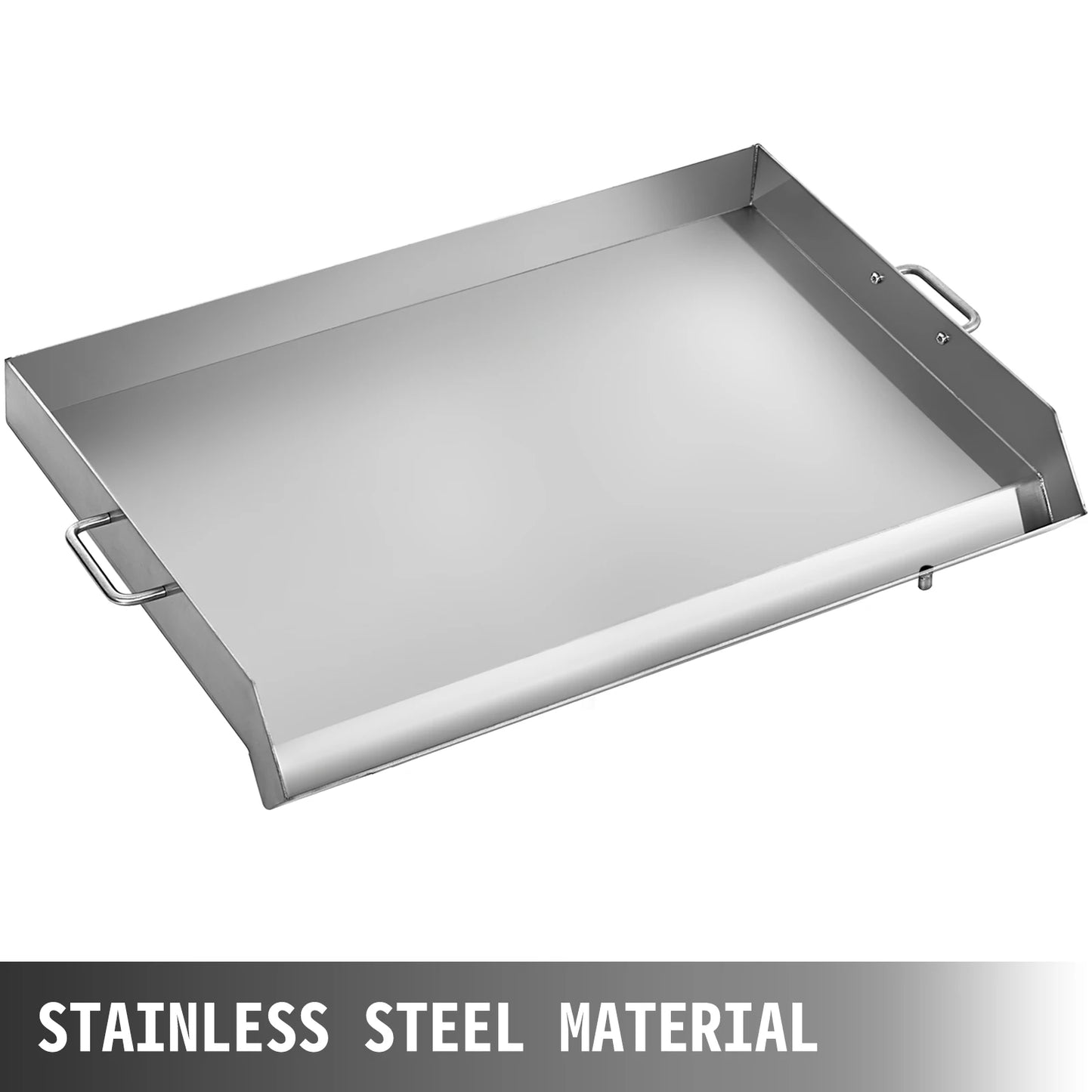
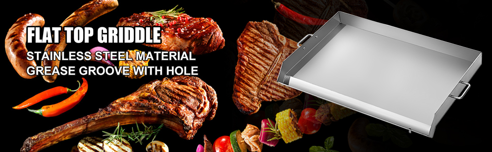
【PREMIUM MATERIAL】- Made of high-quality stainless steel material, high-temperature resistance, durable and sturdy to use. Our flat top griddle can stand up for a longer working period.
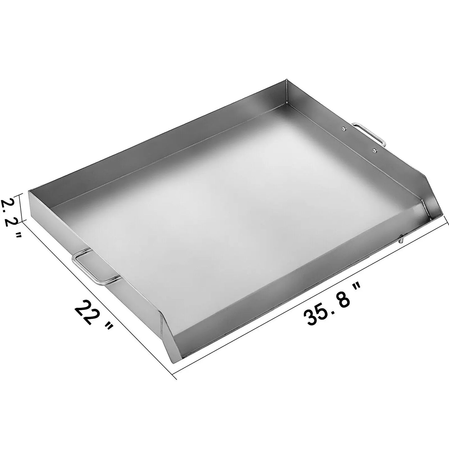
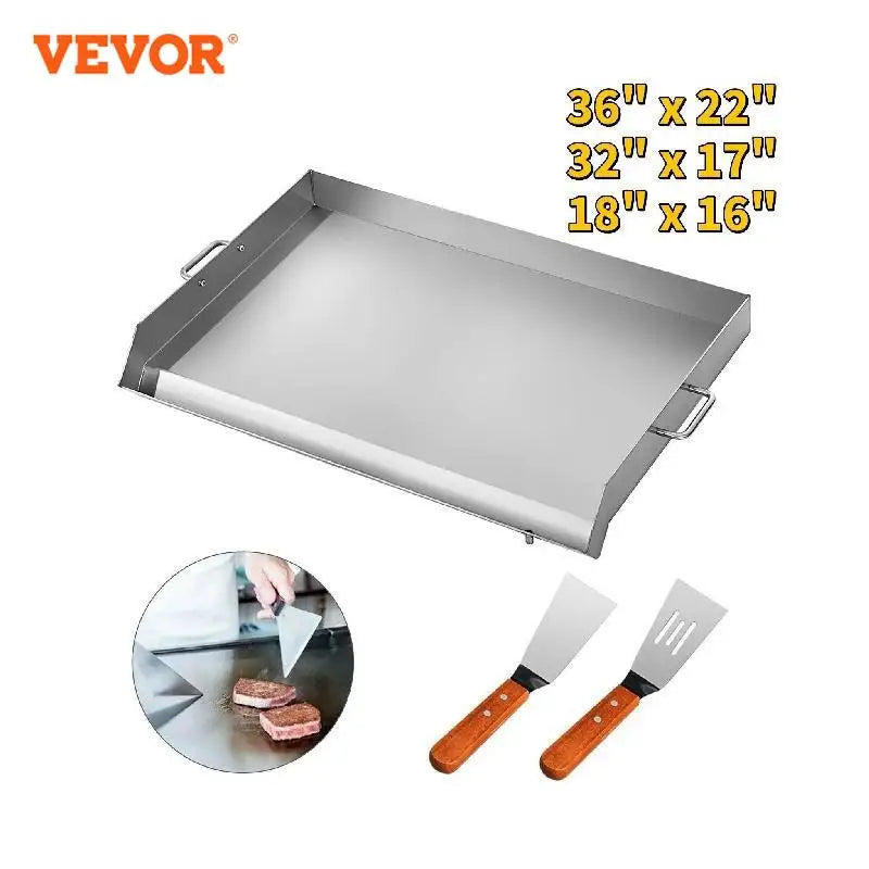
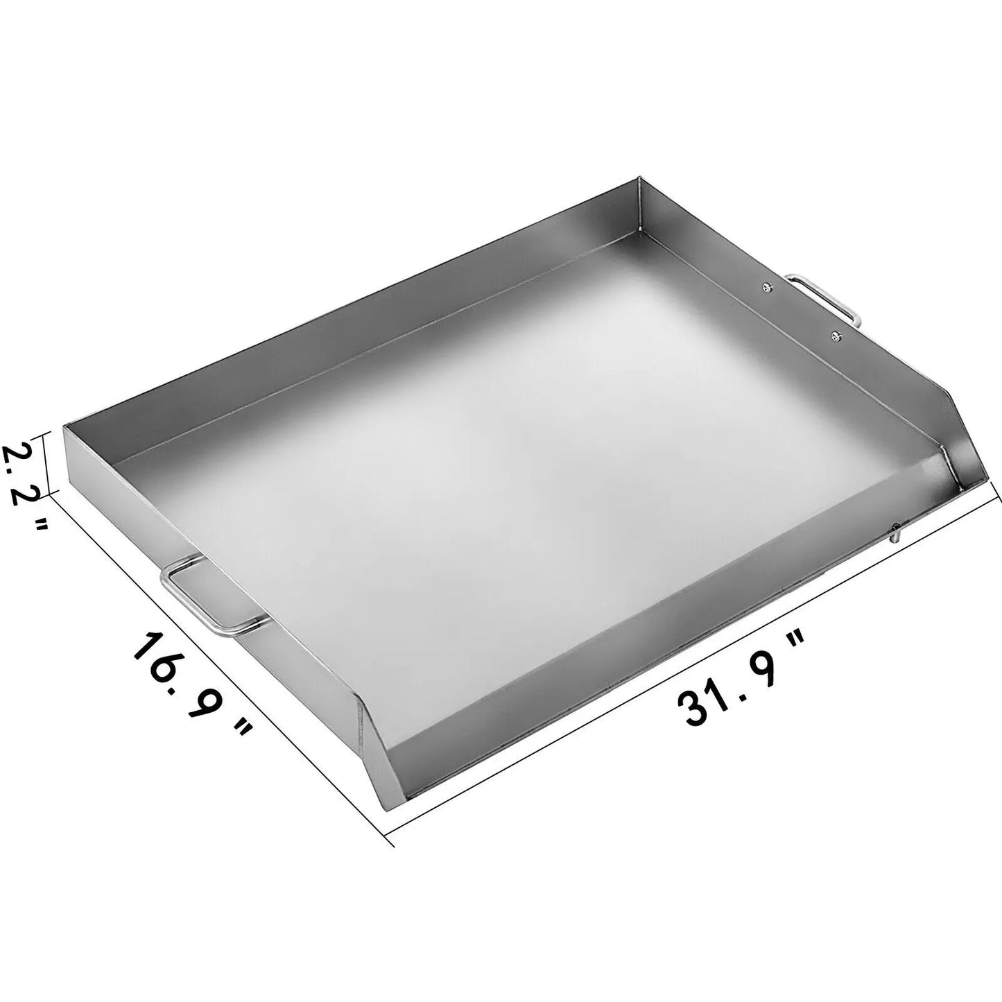
【LARGE SIZE】- Length:15.7”/31.9”/ 35.8”; Width: 18.1”/16.9”/22”. This stainless steel griddle is great for sitting on your charcoal or gas grill to cook all kinds of food. Large enough to cook kinds of foods together.
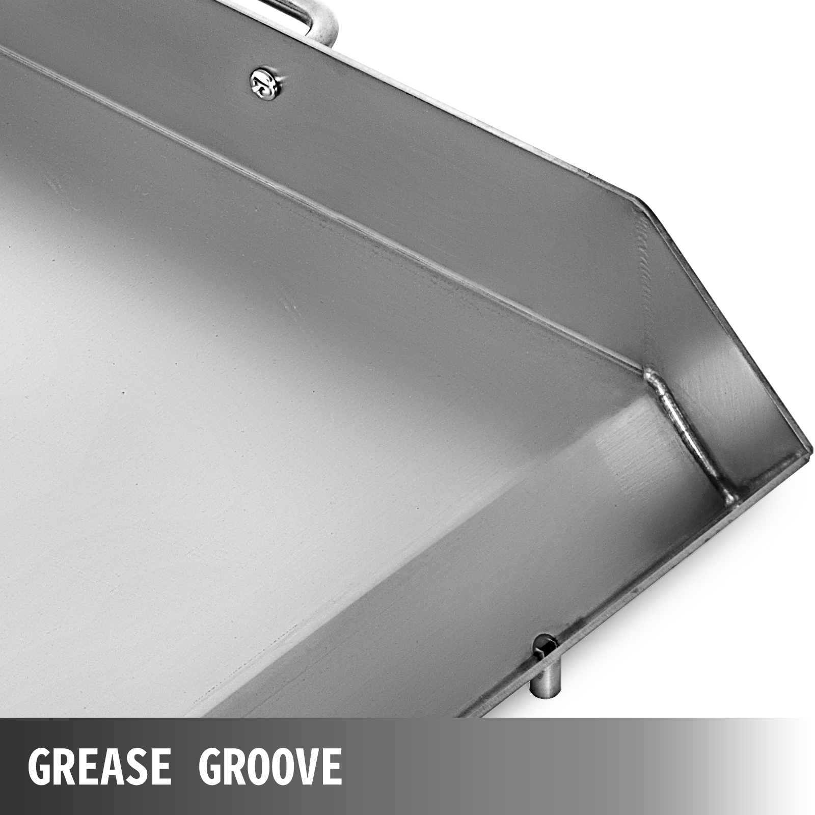
【GREASE GROOVE WITH HOLE】- Reasonable-size grease groove at the front can accommodate food residues and collect oil while cooking, makes cleanup a snap. The griddle grill is designed with a drain hole, which can let oil residues through.
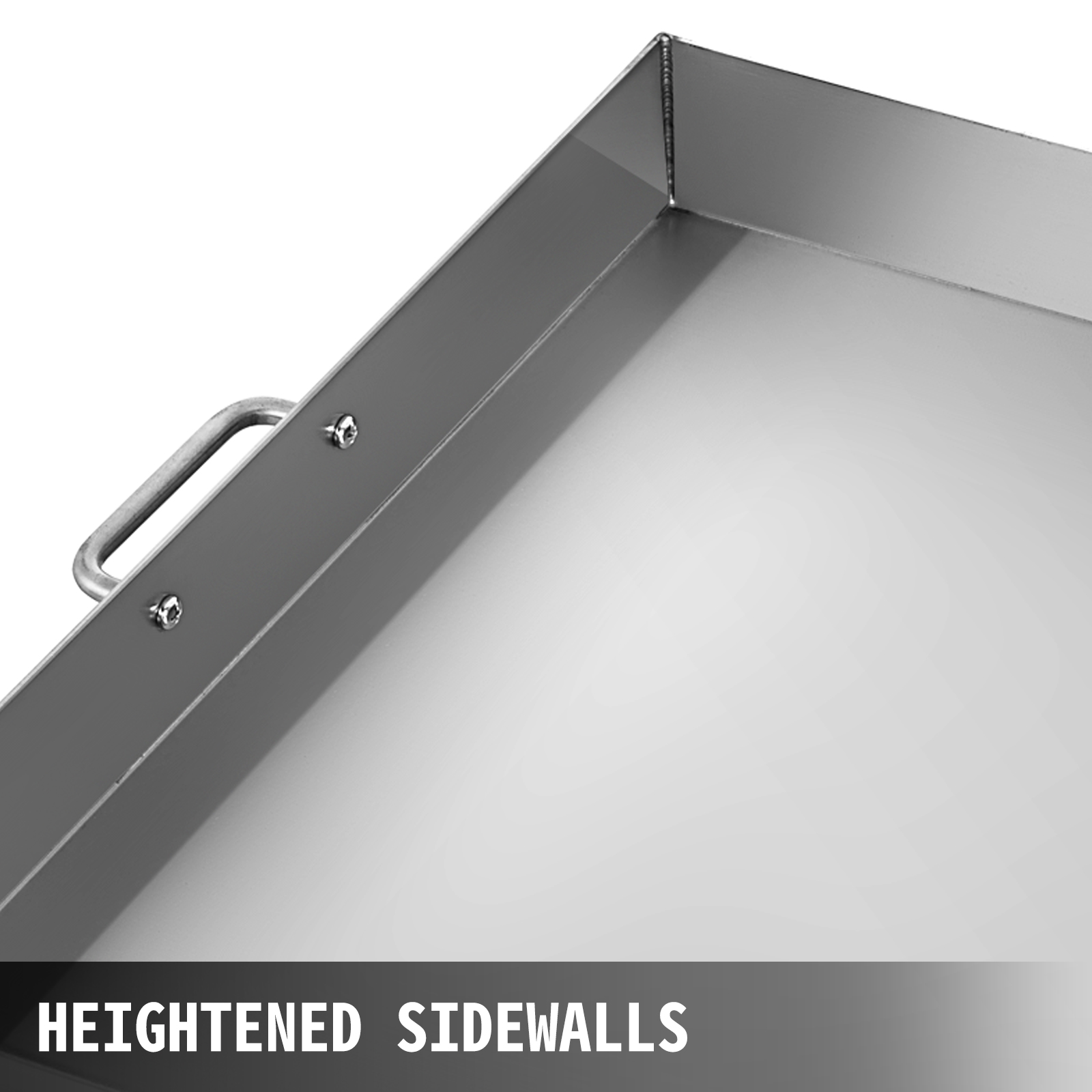
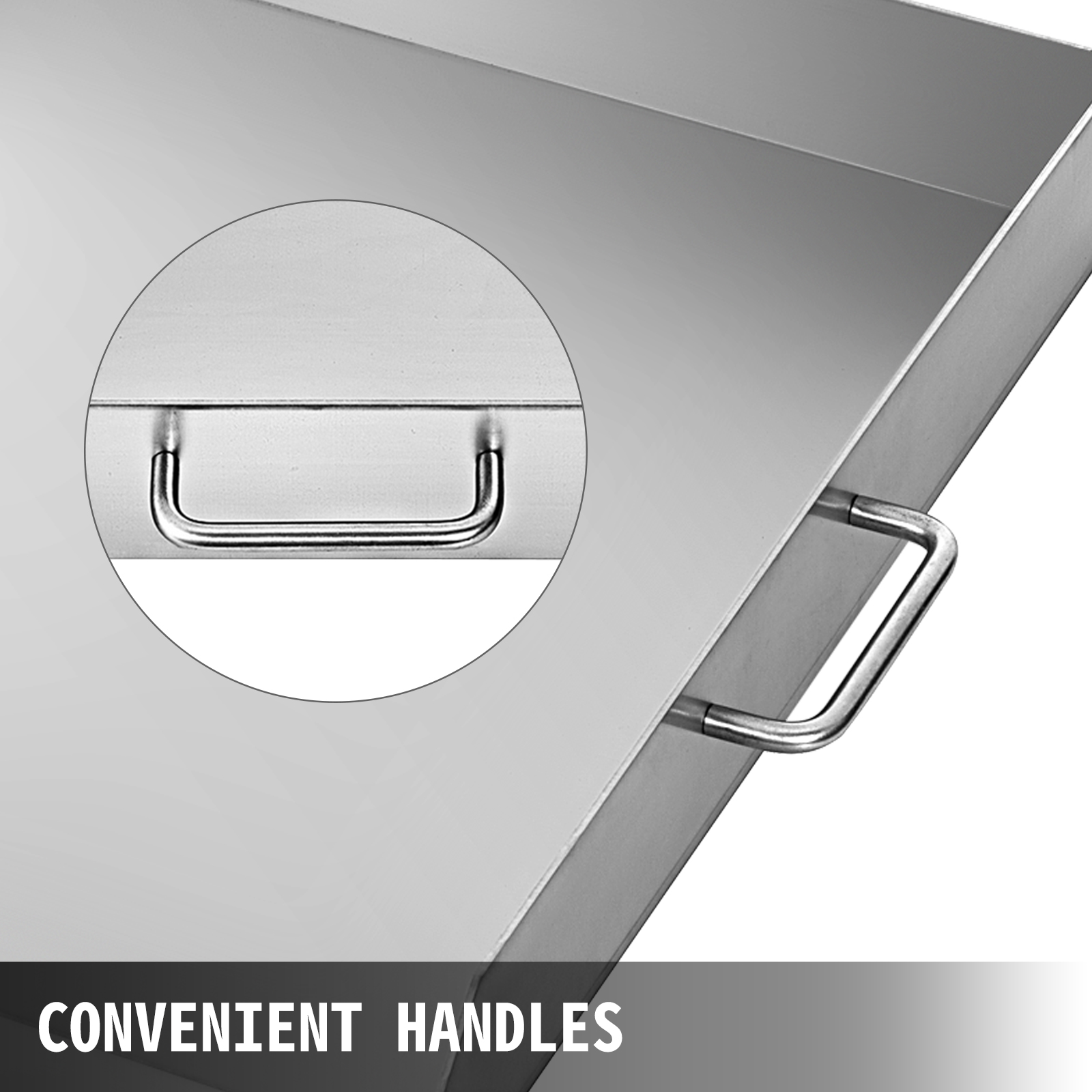
【CONSIDERATE DETAIL】- Heightened Sidewalls, ideal for dishes flipping and turning, keep food on griddle. Convenient handles mounted on two sides, easy to move. The surface is non-stick and easy to clean.
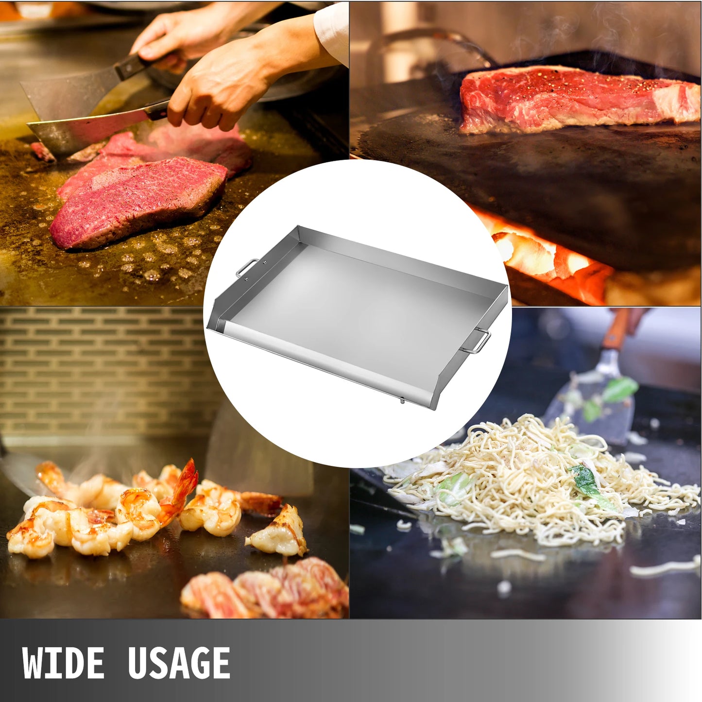
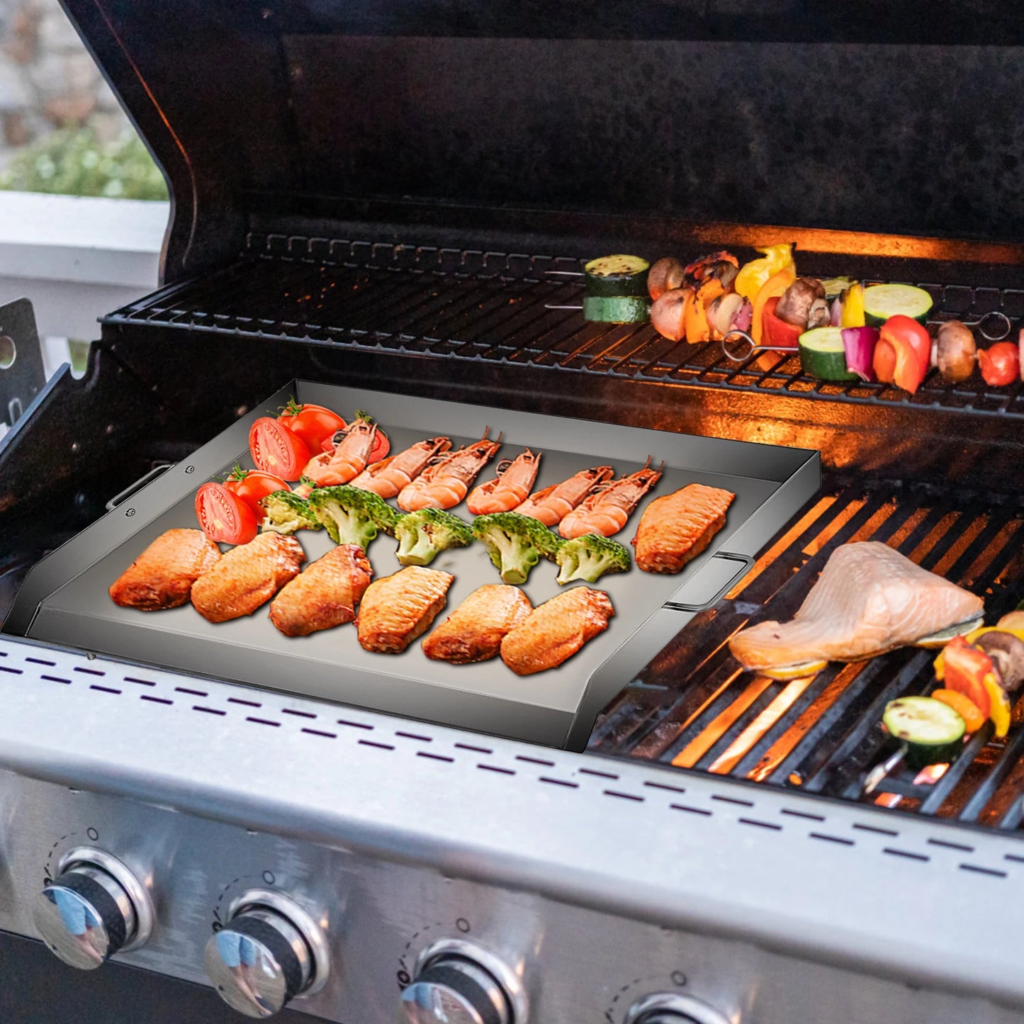
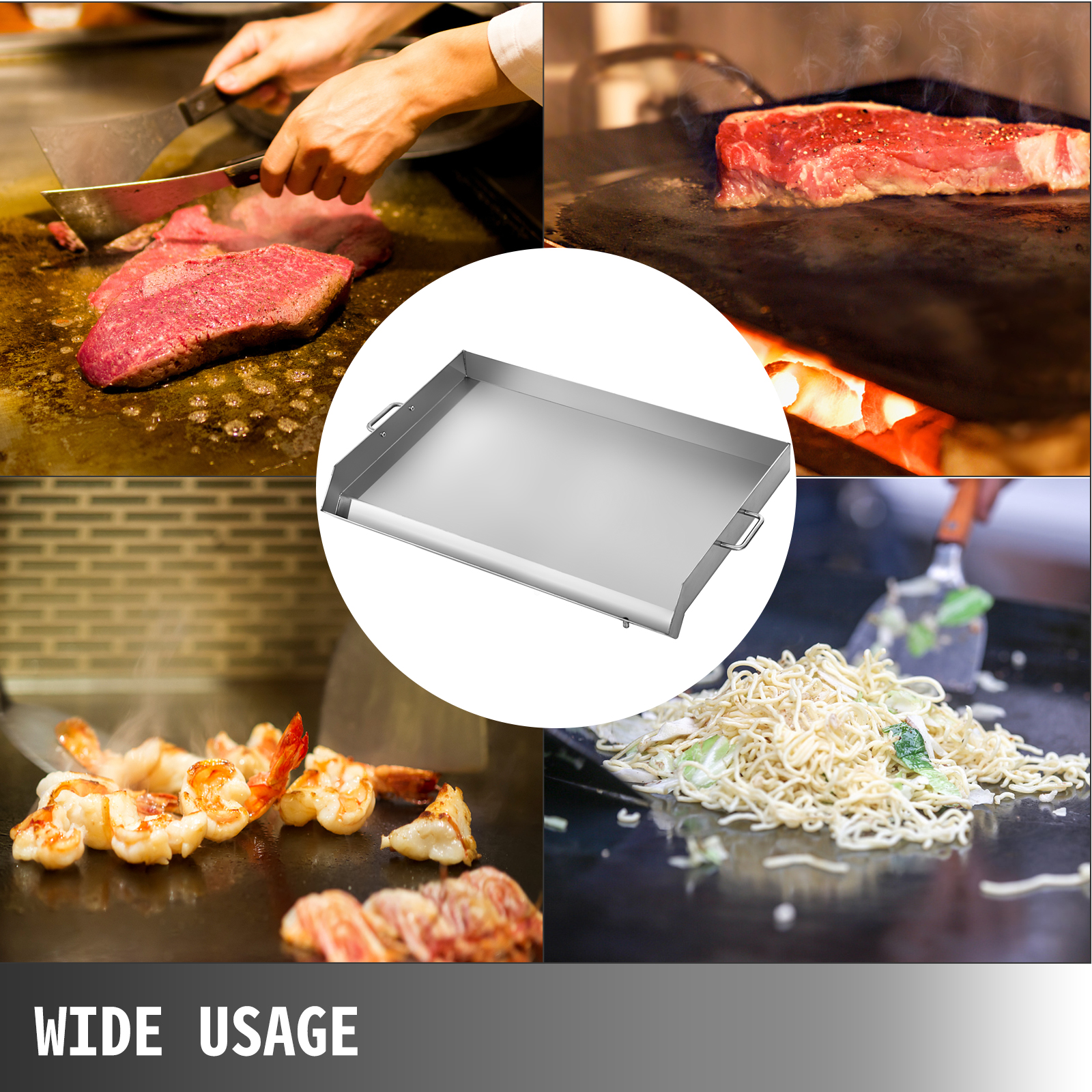
【WIDE APPLICAITON】- This griddle for grill can be used on electric griddles, gas stoves, and charcoals. Fits perfectly over Triple burner stand for the most even heat distribution. Able to cook pancakes, bacon, eggs, vegetables, shrimps, salmon, etc.
Key Features
-

Stainless Steel Material
Adopts thickened stainless steel material(2.5mm in thickness), durable, against heat, and not easy to deform. Easy to clean and maintain. -

Large Surface
With 15.7 x 18.1 /31.9 x 16.9/35.8 x 22 inch large surface, ideal for cooking pancakes, bacon, eggs, vegetables, and practically any type of food. Easily handle daily use, busy kitchens. -
Grease Groove
Equipped with the grease groove, which can catch the grease/oil. A drain hole mounted on the grease groove, you just need to put bags or containers below to catch the oil residues. -
Heightened Sidewalls
The raised edge around is for easy dishes flipping and turning, no need to worry about the food spilling during the flip. -
Convenient Handles
Two rectangular handles on both sides allow you to easily move it from place to place. Light weight, make it portable and easy to store. -
Wide Usage
Ideal for using over electric griddles, gas stoves, and charcoals. Widely used in camps, parties and other outdoor activities.
Here we offer you a stainless steel flat top griddle. It is great for sitting on your charcoal or gas grill to cook all kinds of food. Cook breakfast, lunch, or dinner outdoors, keep your kitchen clean from oily fume, and free from lingering odors. With this, you can cook pancakes, bacon, eggs, vegetables, shrimps, salmon, and so on. Ideal for camping, party, BBQ, and other activities.
Stainless Steel Material
Large Surface
Considerate Design
Wide Application
Material: Stainless Steel
Color: Silver
Item Dimension: 40 x 46 x 5.6 cm/15.7 x 18.1 x 2.2 inch
Packing Weight: 6 kg/14 lbs
1 x Flat Top Griddle
2 x Shovels

Here we offer you a stainless steel flat top griddle. It is great for sitting on your charcoal or gas grill to cook all kinds of food. Cook breakfast, lunch, or dinner outdoors, keep your kitchen clean from oily fume, and free from lingering odors. With this, you can cook pancakes, bacon, eggs, vegetables, shrimps, salmon, and so on. Ideal for camping, party, BBQ, and other activities.
Stainless Steel Material
Large Surface
Considerate Design
Wide Application
Material: Stainless Steel
Color: Silver
Item Dimension:81 x 43 x 5.6 cm/31.9 x 16.9 x 2.2 inch
Packing Weight: 12kg/27lbs
1 x Flat Top Griddle
2 x Shovels
Here we offer you a stainless steel flat top griddle. It is great for sitting on your charcoal or gas grill to cook all kinds of food. Cook breakfast, lunch, or dinner outdoors, keep your kitchen clean from oily fume, and free from lingering odors. With this, you can cook pancakes, bacon, eggs, vegetables, shrimps, salmon, and so on. Ideal for camping, party, BBQ, and other activities.
Stainless Steel Material
Large Surface
Considerate Design
Wide Application
Material: Stainless Steel
Color: Silver
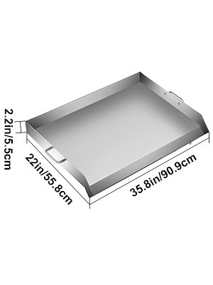
Item Dimension: 91 x 56 x 5.6 cm/ 35.8 x 22 x 2.2 inch
Gross weight: 18 kg/ 40 lbs
1 x Universal Griddle Flat Top
2 x Detachable Handles